The last few weeks since the FAS (Football Association of Singapore) announced the fixture list for the 26th season of the SPL (Singapore Premier League) has been like sitting under the Christmas tree opening presents for a fan.
From a new official ball sponsor to the signing of the most expensive player in the SPL – Brazilian Diego Lopes from Portuguese Primera Liga side Rio Ave for 1.8 million euros (S$2.89million), this upcoming season looks to be the most exciting one yet.
Although there hasn’t been any official announcement from the FAS, JPF has noticed a new typeface being introduced as well.
Following the footsteps of the J-League which announced their own typeface rebranding in September last year, this exercise is a welcomed one.

(Photos: Facebook/ Geylang International)
At this moment, we have no information on the agency or firm that designed this presently unnamed font.
OPINION
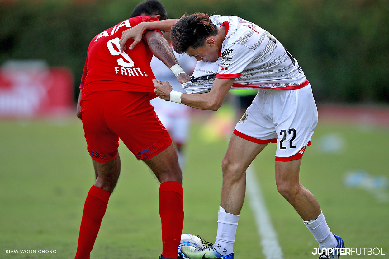
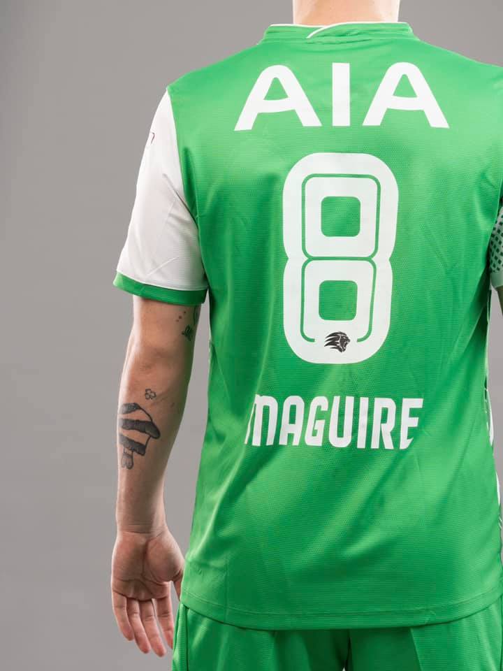
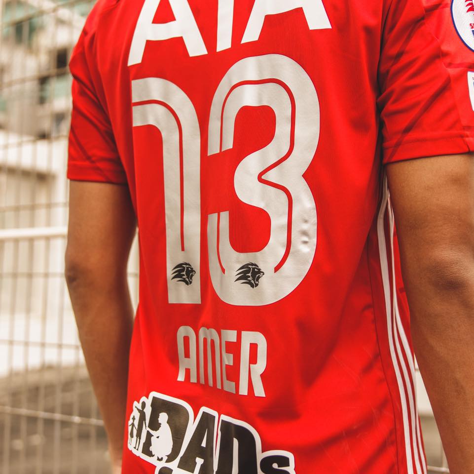
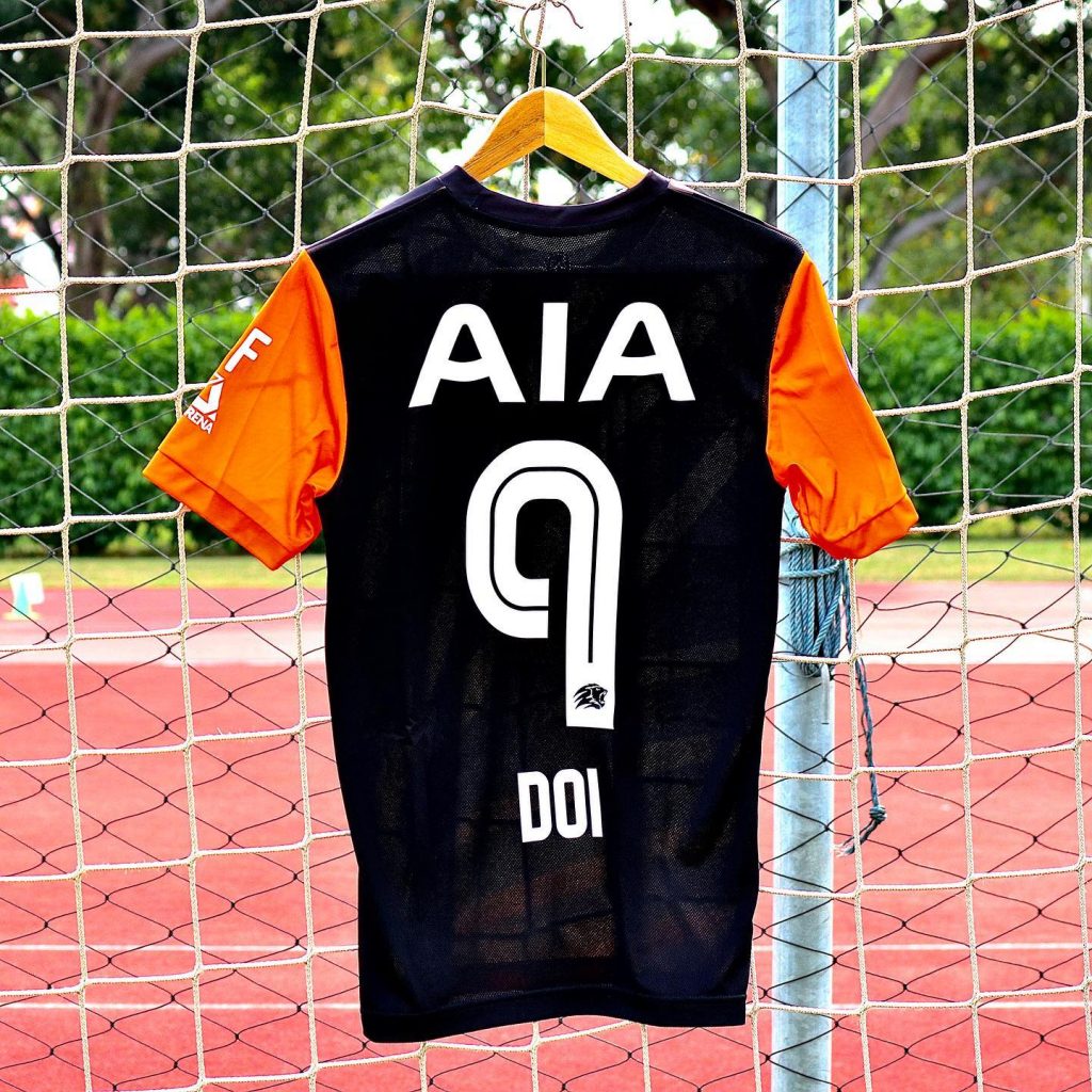
It seems to fit well on the back of various jerseys with the players’ names sitting just below the number as compared to the traditional style we see in popular leagues like the EPL, LaLiga or the Serie A. Instead, we have a huge heat pressed logo of the league’s principal sponsor – AIA.

(Photo: Facebook/ Balestier Khalsa)
The roman characters have fairly compact interiors with strong curves. They are featured all in upper cases and have an uplifting impression about them.
The numerical characters have even stronger curves and feature an internal track. It seems bolder and has a futuristic air about the characters.
However, the complicated Lion head logo of the SPL at the foot of the number manages a good impression of a lost spectator on an F1 track.

(Photo: Facebook/ Hougang United)
JPF spoke to a few fans and design professionals on the new typeface:
“Not a fan of the ‘tech’ style they chose. But it looks to be a commissioned work which is a good change from the random fonts they used in previous years. I think people would love to hear about the processes and thought behind this new identity” – Faris Kassim, Designer based in Seoul.
“The new typeface is neither interesting nor ugly for me. It’s mediocre and not groundbreaking. I see it as another missed opportunity for the SPL to engage existing or possibly new fans with good design. On another note, they should look at rebranding the club logos first.” – Edwin Tan, Creative Director, Bravo.
“We’re happy to see that effort put into enhancing the players’ kit. It’s a good move from FAS to change the font because it definitely looks better now compared to previous years. And with our local clubs now taking more effort with their kit design, this new font will complement their efforts.” – Nazhan, Producer-in-chief, The Final Whistle Podcast.
We imagine this tweak of font type by the SPL is with the consideration that fans are still not allowed to consume matches live due to the pandemic and an effort to improve the viewing experience for the fans, especially with the increase of viewership on mobile devices.


67 thoughts on “The Singapore Premier League’s New Typeface”
Comments are closed.